SERVICES
CATEGORY
YEAR
About the project
OutcomesAI is an AI-powered nursing platform that helps care teams reduce administrative load and bring focus back to patient care.
Based in Boston, OutcomesAI was created to solve for the global nursing shortage. Their core product, Glia is an AI engine that automates routine patient interactions to increase nursing capacity.
Ahead of its market launch, OutcomesAI needed a new brand identity and website that clearly communicates the product offering, signals the impact of what the product could do and earn trust with C-suite decision-makers.

my role
I worked as the primary visual designer, translating the brand into a cohesive system defining the color palette, imagery style, and pattern application. I created marketing materials, used AI for storyboards, and guided the motion designer on videos showing how Glia supports nurses.

the challenge
OutcomesAI's existing brand was clinical, jargon-heavy, and hiding its own product. This made it harder for decision-makers to see its value. As the company commercialised, it needed a clearer presence to convey its vision and stand out in AI healthcare space.
Core concept
Rebuilding the brand around care – Glia as an invisible layer of support
We repositioned the brand from being tech-centered to reflecting its true purpose of strengthening human connection, not replacing it. The strategy shifted to spotlight the people at the heart of healthcare crisis – nurses. Visuals were designed to feel warm, calm, and quietly assistive.


key decision
Giving form to invisible intelligence
The logo retained its core idea of neural networks as a metaphor for biological and artificial intelligence but was refined to feel more minimal, balanced, and dynamic.
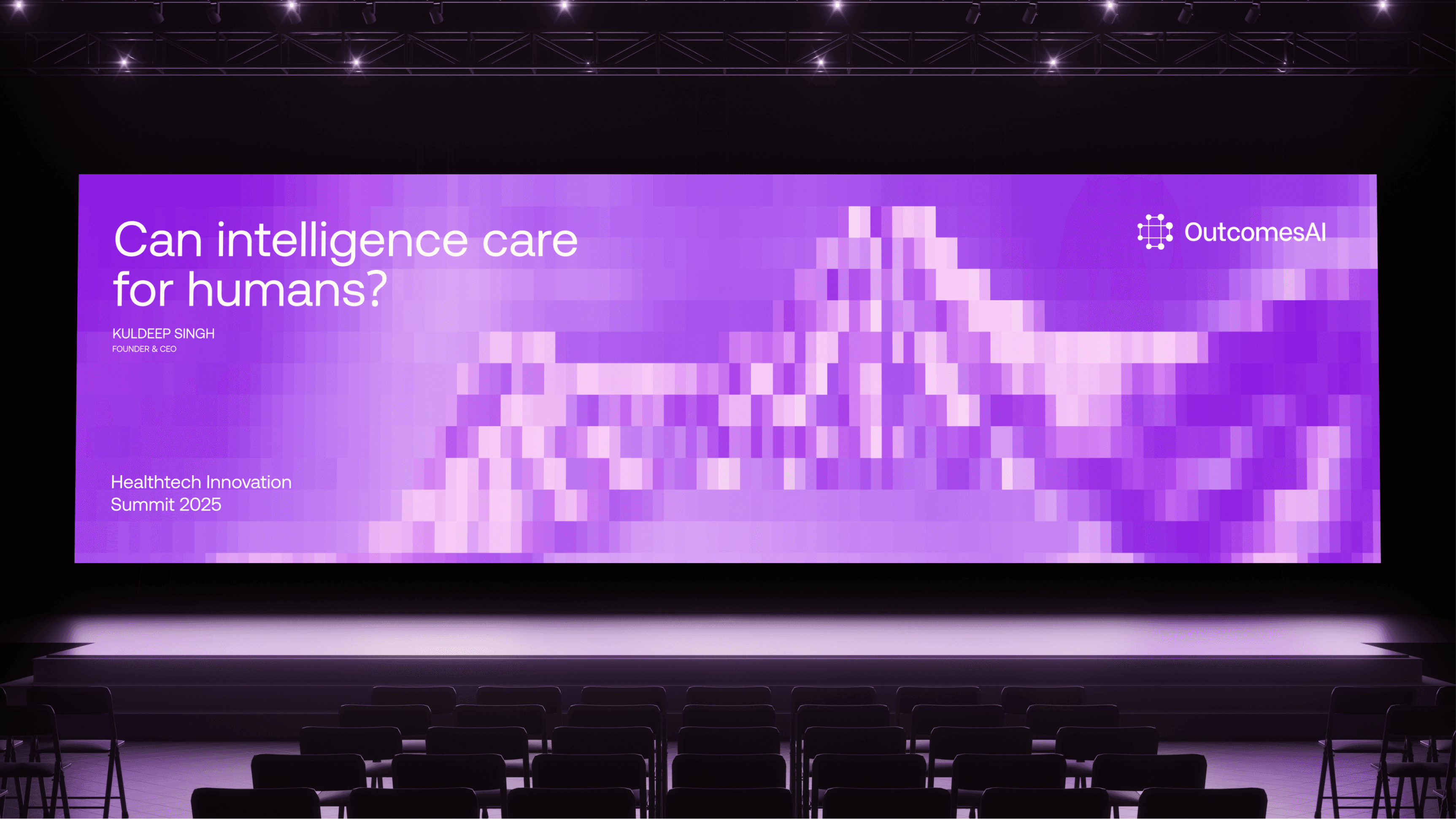
Healthtech defaults to clinical blues and sterile greys. Instead, we moved to a soft palette of violet, pink & coral pastels to signal warmth and empathy, deliberately echoing the nurse-centric repositioning.


key decision
Representing Glia through pixels
To visualise Glia as an invisible layer of support, we developed a pixel pattern of frosted squares and rectangles that sit subtly over imagery and UI. The pattern represents the unseen layer of AI quietly supporting nurses behind the scenes. These abstract forms shift subtly across imagery, suggesting movement, responsiveness, and intelligence at work.


key decision
Turning complexity to clarity
The Gila Diagram helps viewers grasp how Glia works beneath the surface, without the jargon. The illustration translates how inputs like text, audio, and patient data flow through Glia's orchestration layers into something a C-suite decision-maker could grasp in seconds.


the impact
Shortly after the brand and website launching, OutcomesAI closed a $10M seed round led by Santé Ventures, a signal that the positioning and storytelling landed where it needed to.
The new brand gave C-suite decision-makers a clear understanding of what Glia does and why it matters. The product narrative became sharper and more visible, and the brand established a distinct presence in a market that had been defaulting to the same clinical aesthetic for years.
Credits
This project was completed at Pineapple in collaboration with the brand, product and motion design teams.

